Highlights
Form & Function
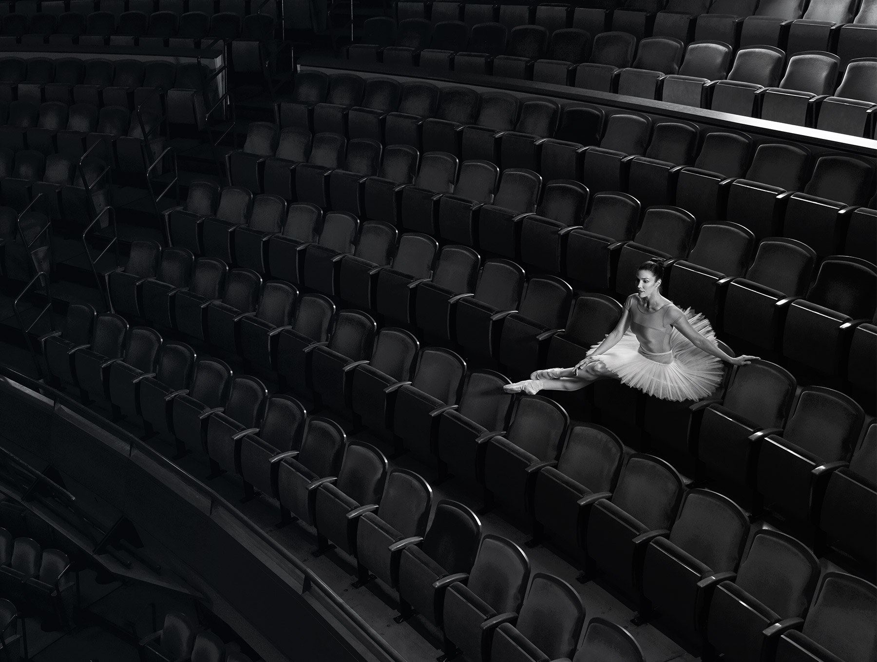
A flexible suite of logos, color palettes and design elements, as well as versatile custom photography fluidly combined to generate fresh, unified digital and print collateral. The design team also had to be considerate of Ballet Austin’s broad demographic, ranging from children to older donors, and adjust design decisions accordingly to maintain broad appeal.
The extensive collection of collateral reinforced the Ballet Austin brand voice, and was strengthened further when paired with the modularly developed website. This modular system allowed departments to easily create and update website content while still adhering to the overall visual brand standards of the company.


